Back to Projects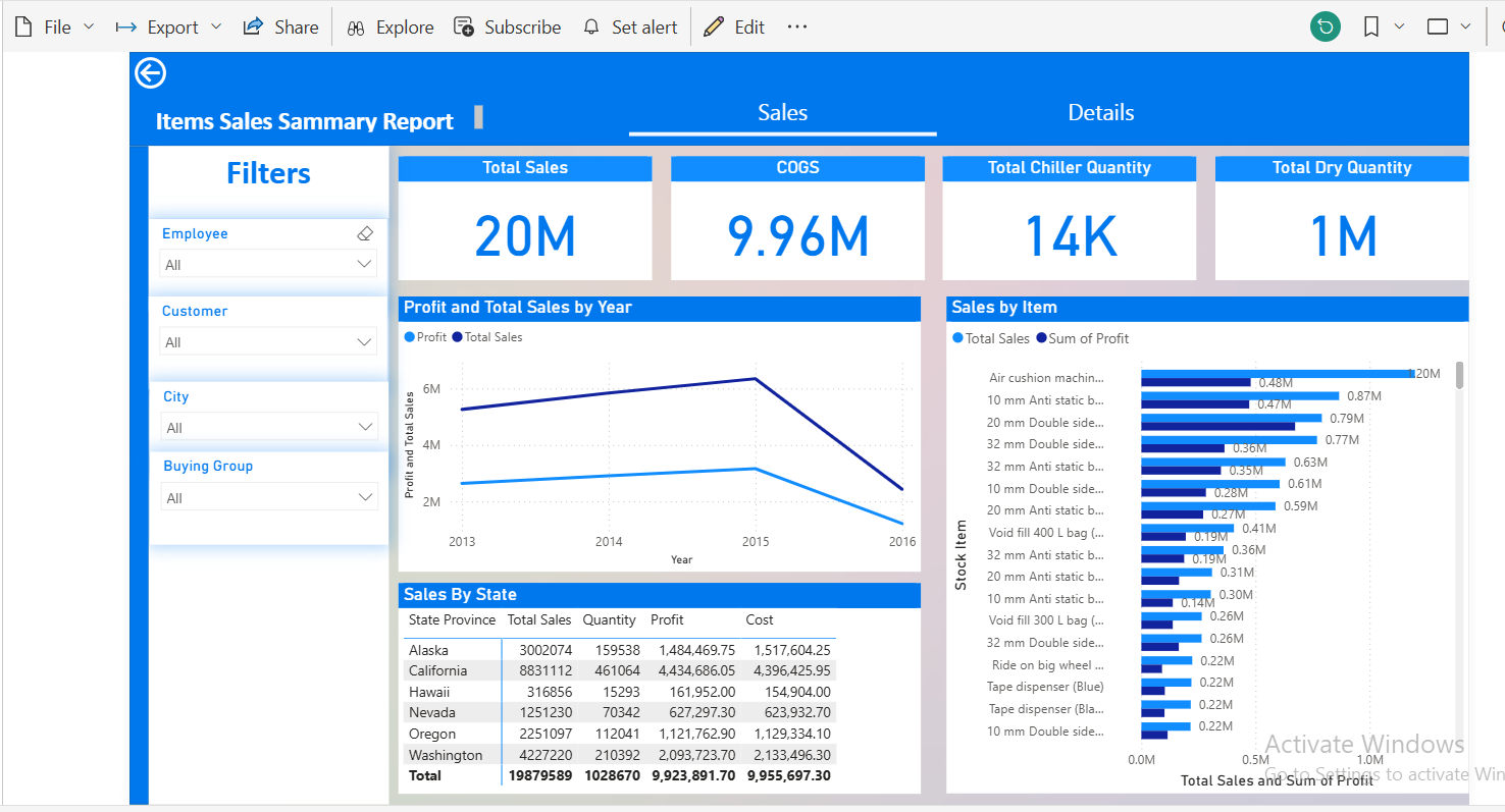
DashboardDashboardCompleted
Sales Report Dashboard
The Sales Report Dashboard is developed using Power BI to analyze sales performance and visually present data for quick understanding of key performance indicators.
Power BIData VisualizationBusiness IntelligenceData AnalysisExcelDAXPower Query
Overview
This project focuses on transforming raw sales data into an interactive dashboard that displays essential figures and indicators, such as total sales, number of orders, product performance, branch performance, and sales trends over different periods. The dashboard serves as a vital tool for management and sales teams to monitor performance and make informed decisions based on data.
Problem / Challenge
The primary issue was the difficulty in reading and analyzing sales data when presented in raw table formats. Relying solely on tables can lead to several problems:
- Difficulty in quickly identifying total sales
- Challenges in comparing performance across products or periods
- Difficulty in tracking monthly or yearly trends
- Time-consuming manual report preparation
- Potential errors during calculations or summarization
- Lack of clarity on top-performing products or branches
A need arose for an interactive dashboard that presents key sales indicators in a clear and accessible manner.
Solution
The Sales Report Dashboard was developed using Power BI to present sales data in an interactive and organized manner. The data was prepared and transformed into indicators and graphs that help users quickly understand overall performance. The dashboard displays important summaries such as total sales, number of transactions, product performance, and trend analysis over time or by available categories in the data. Interactive filters and visualizations within Power BI allow users to explore data from multiple angles without needing to manually adjust the original tables. The result is a simple and clear dashboard that aids in data reading and decision-making based on real numbers.
Key Features
1
Interactive dashboard using Power BI
2
Clear display of total sales
3
Analysis of product or category performance
4
Tracking sales trends over time
5
Use of graphs to facilitate data reading
6
Interactive filters for data exploration
7
Summarization of raw data into easy-to-understand indicators
8
Organized design for quick monitoring by management or sales teams
Results / Impact
1
Facilitated monitoring of sales performance
2
Reduced time required for manual report preparation
3
Improved clarity of performance indicators
4
Assisted management in making better decisions
5
Simplified comparison of products or time periods
6
Reduced reliance on manual table reading
7
Presented data in a more professional visual format